Widget Appearance
WebSpeaker lets you fully customize the visual appearance of the widget to match your website’s branding and design. Through the theme editor in the management portal, you can adjust colors, gradients, and styles, with a real-time preview that shows exactly how the widget will look on your site.
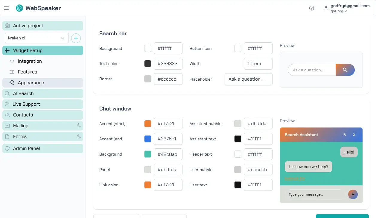
Theme Editor
To customize the widget appearance, navigate to your project in the management portal and open the Appearance section under Widget Setup. The theme editor provides a visual interface where you can modify various aspects of the widget’s look and feel. Every change you make is reflected instantly in the preview panel, allowing you to experiment with different styles before applying them.
The theme editor is designed to be intuitive. You select the element you want to customize, choose your preferred colors or styles, and see the result immediately. No CSS knowledge or coding is required.
Color Customization
The primary customization options revolve around colors. You can set the main accent color used for buttons, links, and interactive elements. You can also configure gradient backgrounds for the widget header, giving you a polished, branded look. The editor provides a color picker for precise control, and you can enter hex color codes directly if you have specific brand colors to match.
Key color settings include the primary color (used for the chat bubble, buttons, and highlights), the header gradient (which defines the background of the widget header area), and text colors. The system automatically adjusts contrast to ensure readability, but you should always verify the preview to confirm that text remains legible against your chosen background colors.
Suggested Themes
If you prefer a quick starting point, WebSpeaker offers a selection of suggested themes. These color palettes are generated based on the current colors of your website, so they blend naturally with your existing design. You can select a suggested theme and then further customize individual colors to fine-tune it to your preferences.
Suggested themes cover a range of styles from clean and minimal to bold and colorful. They serve as a good foundation if you are unsure where to start with customization.
Bubble Position
The floating chat bubble can be configured separately from the rest of the widget appearance. In the management portal, open Widget Setup -> Appearance -> Position to control where the bubble is displayed on your website.
You can choose the corner in which the bubble should appear and define separate offsets for desktop and mobile devices. This makes it easier to avoid conflicts with sticky navigation bars, cookie banners, contact buttons, or other fixed elements already present on your site.
The z-index setting lets you control how strongly the bubble should stay above other page elements. Increase it when the launcher is hidden behind banners, headers, or embedded widgets. Lower values may be useful if your website already uses overlays or floating controls that should remain on top.
Position settings are only relevant when the Floating Chat Bubble (FAB) feature is enabled. If the bubble is turned off, the position controls remain unavailable until the launcher is enabled again.
Reset to Defaults
If your customizations do not turn out as expected, you can reset the widget appearance back to the default theme at any time. The reset option restores all color and style settings to their original values, giving you a clean slate to start over. This is a safe way to experiment with different looks without worrying about losing track of the original settings.
Applying Changes
Changes to the widget appearance take effect immediately after you save them. There is no need to update the widget snippet on your website or redeploy anything. The widget automatically loads the latest appearance settings each time a visitor opens it, ensuring that your branding updates are reflected across your site instantly.